Inconsistent icons are not “tiny stuff”—they are a system failure. When glyphs are messy, build pipelines choke. When families are undisciplined, the UI looks noisy. Icons are infrastructure, and a coherent library is the only fix for this cross-platform chaos.
- The Problem Icons Are Supposed to Solve
- A System, Not a Grab‑Bag
- Design Tokens First, Everything Else Later
- Web: Deliver Icons via Sprite Sheets; Inline Only When Necessary
- Mobile Without Drama
- Semantics and Localization You Won’t Regret
- Performance That Holds Up in CI and on Low‑End Devices
- The Messaging and Platform Layer Most Apps Need
- QA Checklist That Actually Catches Problems
- Turning Design to Code Without Rework
- Classroom, Bootcamps, and Teams New to Systems Thinking
- Cross‑Platform Edge Cases That Bite Later
- Governance: Treat Icons Like Code
- What Designers Notice (and Users Feel)
- What Developers Appreciate (because it saves time)
- Quick Start for an App Team
- Bottom Line for App Creation
The Problem Icons Are Supposed to Solve
Shipping an app is mostly glue work: design tokens, lint rules, CI builds, and reviews that catch the tiny stuff users still notice. Icons live in that glue. If the library is inconsistent, your interface looks noisy. If the files are messy, your pipeline chokes. Icons8 earns its keep by giving you clean vectors, disciplined families, and formats that work across web, iOS, Android, and cross‑platform stacks without weekend surgery.
A System, Not a Grab‑Bag
Icons are micro‑systems. Weight, corner radii, counters, and negative space form a grammar. Icons8 treats that grammar as a contract. Outline, filled, rounded, and sharp families stay internally coherent, so switching emphasis (outline→filled) doesn’t break rhythm. When layouts compress to 16–20 px, silhouettes remain recognizable because the optical tweaks—nudged circles, trimmed terminals—are already baked in.
Also Read: 10 Free Music Apps for Streaming & Downloads (2025 Guide)
Design Tokens First, Everything Else Later
Icons only behave if they listen to tokens.
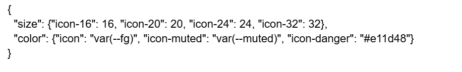
Bind SVG width/height to these sizes. Color with currentColor. Icons8 ships with sane viewBoxes (commonly 0 0 24 24 or 0 0 32 32), so one component can drive all glyphs without per‑icon hacks.
Web: Deliver Icons via Sprite Sheets; Inline Only When Necessary
- Sprite approach: compile an SVG sprite of your top 80–120 glyphs. <use href=”#message-circle”/> is cache‑friendly and keeps bundles small.
- Inline components: prefer for accessibility (aria-label) or per‑instance animation. Icons8’s minimal groups and filters make them easy to animate with CSS or a small motion library.
- Build hygiene: run svgo with conservative precision; Icons8 paths are already lean, so don’t over‑optimize into geometry errors.
Mobile Without Drama
iOS
Export as single‑color PDFs for UI and tint with system colors. If a metaphor conflicts with SF Symbols or brand tone requires a different silhouette, swap in an Icons8 glyph that matches your weight. Marketing surfaces (onboarding, feature cards) can use duotone or filled variants without leaking into core UI.
Android
Favor Vector Drawables. Icons8’s clean paths move from SVG to XML with minimal edits because there are few masks and no surprise filters. For raster fallbacks, export WebP in 1x/2x/3x; keep naming parallel with your SVGs.
Flutter / React Native
Use flutter_svg or react-native-svg. With Icons8’s regularized viewBoxes, one wrapper widget handles sizing and color across the library. Keep a single source of truth for sizes (16/20/24/32) and theme tokens.
Semantics and Localization You Won’t Regret
Metaphors travel badly across regions. Mailbox flags, floppy disks, some hand gestures—context matters. Icons8 usually provides alternates for common intents (envelope, paper plane, chat bubble, handset) so you can pick a culturally neutral option without redrawing. Pair icons with labels in critical flows; when labels collapse, add aria-label or aria-labelledby. For dense UIs, prefer filled or medium stroke weights at 14–16 px.
Performance That Holds Up in CI and on Low‑End Devices
- HTTP/2 + sprites: fewer requests, better cache hits.
- Tree‑shaking: if you compile inline SVG components, shake unused glyphs at build time.
- CPU and rasterization: Icons8 avoids heavy filters; paths are flat, which keeps headless test runs stable.
- Compression: don’t crush decimals below 2–3 places; that’s where curves start to wobble.
The Messaging and Platform Layer Most Apps Need
Three clusters are everywhere: communication, commerce, and system. Icons8 covers them with multiple tones. Chat‑first products lean on dots and bubbles; productivity flows might stick to envelopes or arrows; fintech screens need cards, banks, transfers that survive at 16 px. For platform branding moments, mid‑article placement often needs a crisp mark; the microsoft logo fits status banners and setup wizards in dark or light themes without fiddly pixel massage.
QA Checklist That Actually Catches Problems
- Silhouette works at 16 px. If you have to zoom, the icon fails.
- Counters aren’t clogged. Letters and arrows remain legible.
- Stroke math is consistent—no random 1.3 px lines among 1.5s.
- ViewBox uses even coordinates and centers optically.
- Themeability: fills and strokes inherit currentColor.
Icons8 scores well on these, which means QA focuses on behavior instead of wondering why the gear icon looks haunted.
Turning Design to Code Without Rework
Lock one family per surface (Outline 24 for core UI, Filled 24 for primary actions). Set size tokens and teach the component to accept size and tone. If your brand pivots later, swap families once instead of editing a hundred places. Icons8’s naming (message-circle, message-circle-filled, message-square) keeps diffs readable and makes refactors surgical instead of exploratory.
Classroom, Bootcamps, and Teams New to Systems Thinking
Icons8 is also decent for teaching.
- Contrast lab: outline icons over images until recognition fails; switch to filled and record the threshold.
- Metaphor audit: save = cloud vs. tray vs. disk; discuss which survives at 16 px and why.
- Grid discipline: redraw three Icons8 glyphs at 12/16/24 px and keep silhouette integrity.
These exercises show why a coherent library beats a collage of “free” downloads.
Cross‑Platform Edge Cases That Bite Later
- Electron/PWA: rasterize favicons from a single SVG source; Icons8 silhouettes hold at 16×16.
- Email clients: many still dislike inline SVG. Export PNG/WebP; keep filenames aligned with your SVGs so templates don’t drift.
- Canvas/WebGL: if you convert paths to polygon meshes, Icons8’s clean shapes tessellate with fewer vertices.
Governance: Treat Icons Like Code
Put icons in the repo with the product, not in a random drive. Gate new glyphs behind design review. Lint for forbidden inline colors and duplicate IDs. Maintain a small “alternates” folder for A/B tests. When silhouettes change, add a changelog entry so QA knows what to look at. Icons8’s predictable structure keeps this cheap.
What Designers Notice (and Users Feel)
- Corner radii are rational—rounded sets don’t fight sharp sets.
- Optical corrections keep curves from shimmering on standard‑DPI displays.
- Family grammar: notifications, actions, and objects each read as a track, so nothing feels out of place.
What Developers Appreciate (because it saves time)
- Deterministic alignment: icons center the way math says they should.
- Sprite friendliness: no stray defs, no duplicated symbols.
- Test stability: minimal filters mean headless renderers behave the same locally and in CI.
Quick Start for an App Team
- Choose a base family (Outline 24 or Filled 24) and stick with it across core UI.
- Define –icon-size tokens (16/20/24/32) and wire them to a single icon component.
- Build an SVG sprite for the first 100 glyphs.
- Add lint rules: block inline colors and non‑standard viewBoxes.
- Keep an “alternates” set for experiments; don’t mix vendors inside one surface.
Bottom Line for App Creation
Icons8 behaves like an engineering resource, not a Pinterest board. Clean vectors and coherent families make it safe to theme, compress, and ship across stacks. For teams building apps—web, mobile, cross‑platform—it reduces redraws, quiets bundle noise, and keeps the focus on product behavior. That’s the job icons are supposed to do, and this library lets them do it without drama.