Ever paused mid-scroll because someone’s photo practically reached out and glowed at you? Maybe it was a yellow umbrella under a moody sky or a neon pink blazer on a rainy sidewalk. Those color-popping, eye-hooking posts don’t just happen — they’re curated with clever saturation, balanced hues, and a touch of emotional flair. That’s right: you can color your content like a pro, and yes, Pippit makes it ridiculously easy.
So, whether you’re remixing your travel gallery or polishing a brand flat lay, the color story you tell can transform casual glances into engagement. Before we dive deep, picture this: you’re editing a sun-drenched coastal shot and want that turquoise to shimmer like a dream. Pippit offers an image enhancer online that lets you dial up saturation, tweak tone, and retouch everything from sky to skin. The goal? A post that lingers rather than merely lands.
Oh, and if you’re pulling clips too? You can always attach your URL to video alongside your feed post and make that cross-platform magic work overtime. Now let’s decode what makes saturation more than just a slider.
- Color is the new caption: How influencers grab attention with hues
- Why saturation matters for feed performance
- Saturation without chaos: Tips to enhance without overdoing it
- Color rules to keep your grid popping — not clashing
- Bright like your energy: Make color edits pop in Pippit
- Feed chemistry: Matching saturation to platform energy
- Platform-by-platform saturation cheat sheet
- Final thoughts
Color is the new caption: How influencers grab attention with hues
Colors speak before your words do. In fact, on visual-first platforms like Instagram or Pinterest, color is often the only thing users notice before deciding whether to double-tap or scroll on.
Why saturation matters for feed performance
- Immediate visual drama: Saturation accentuates tone and contrast. That dusty rose becomes a vivid blush. That seafoam green becomes pure ocean energy.
- Mood setting: High saturation evokes excitement, low saturation suggests calm or nostalgia. It’s like giving your post a personality.
- Brand recognition: Sticking to a unique color palette across posts helps create consistency, one of the biggest trust signals for followers.
Still unsure? Open your feed and look at what made you stop today. Odds are, something bright, bold, or richly toned made the cut.
Saturation without chaos: Tips to enhance without overdoing it
Too much saturation and your content looks radioactive. Too little and it blends into the background. Here’s how influencers strike that perfect tone between vivid and visual fatigue.
Color rules to keep your grid popping — not clashing
- Pick a dominant tone per post: Let one color be the hero — a sunflower dress or cobalt wall. Avoid competing hues in the same frame.
- Use warmth strategically: Adding warmth can make skin tones glow, food look richer, and locations feel sunlit.
- Desaturate the background: One secret weapon? Lower the saturation in the background to let the subject shine. It creates depth and subtle emphasis.
- Pair saturation with sharpness: If your photo is richly colored but blurry, it’ll feel off. Pair it with Pippit’s image enhancer online to boost texture and detail.
Now that your creative instincts are fired up, let’s walk through how to bring it all together using Pippit.
Bright like your energy: Make color edits pop in Pippit
Step 1: Upload your photos
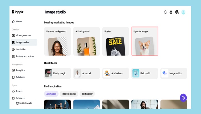
Start by signing up for Pippit’s image resolution enhancer and head to the dashboard. Click ‘Image Studio‘ from the left menu and choose ‘Upscale Image.’ You’ll get an upload prompt — select ‘Device‘ and drag in that juicy shot from your camera roll or desktop folder.
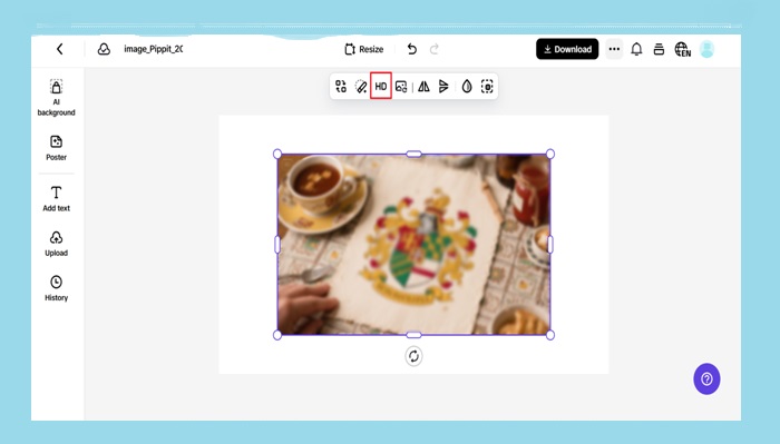
Step 2: Upscale and edit your photos
Here’s where the alchemy of color starts. Leverage the Retouch tool to accentuate your subject’s key attributes. Go to Effects and use well-chosen presets to enhance the mood. Need to adjust brightness, warmth, or vibrancy yourself? The Image Enhancer tool is at your service to fix flat lighting or milky focus. Perk: Place overlays, stickers, or text to add layers of visual narrative directly onto your photo.
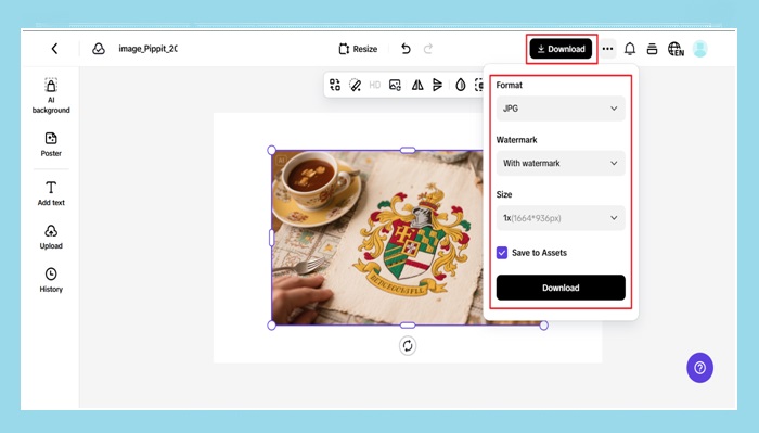
Step 3: Export your images
When you’re happy with the final look (and you’ve resisted the temptation to oversaturate), click ‘Download’ in the top-right corner. Choose your format and resolution, hit ‘Download’ again, and boom — your feed star is ready to shine.
Also Read: How to See Someone’s Best Friends List on Snapchat: The Truth About Knowing
Feed chemistry: Matching saturation to platform energy
Each social platform has a slightly different color language — yes, really. Knowing the vibe of each can help you tweak saturation to fit the platform rather than fight it.
Platform-by-platform saturation cheat sheet
- Instagram: Medium-to-high saturation works well for aesthetics and lifestyle. Users anticipate clean photos and color-coordinated grids.
- Pinterest: Warm tones and high brightness perform best. Enhance your reds, oranges, and sunny neutrals.
- Facebook: In a busier, text-heavy stream, moderate colour with strong contrast jumps out.
- LinkedIn: Adhere to gentle improvements and natural tones. Neon modifications have no place here.
- TikTok: While this is video-first, preview thumbnails matter. Bright cover images and consistent colors across clips keep users clicking.
And if you’re posting a visual teaser with Pippit’s video trimmer on any of these platforms, make sure your enhanced image reflects the same energy as your footage. Think of your image as the movie poster — it sets the mood before they even hit play.
Final thoughts
Saturation is about amplifying what’s already true. You’re not faking moments — just making them more felt. When you start thinking of colors as your emotional soundboard, every edit becomes a way to connect deeper with your audience.
Pippit makes it intuitive, with zero Photoshop headaches and no filter regret. From fixing gray skies to spotlighting your signature shade of lipstick, the image enhancer online helps your pictures look like your memory of the moment, not just the pixels. Ready to glow up your gallery?
Sign up for Pippit today and color your content the way it deserves!