A core app dashboard is the central interface that shows KPIs, system health, and user activity so teams can monitor performance, spot issues early, and make faster decisions.
- What Is a Core App Dashboard?
- The Core Features Users Expect
- The Most Important Metrics to Track First
- How to Design a Dashboard That Drives Decisions
- How to Build and Integrate a Core App Dashboard
- The Missing Piece: From Metrics to Action
- Common Mistakes to Avoid
- Best Tools and Frameworks to Consider
- Final Take
- FAQs
What Is a Core App Dashboard?
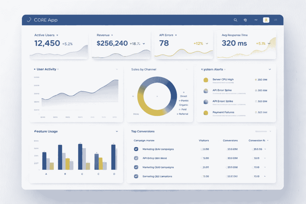
A core app dashboard is the operational view of a digital product. It brings the most important metrics, alerts, and workflows into one interface so decision-makers can see what matters without opening multiple systems.
This is not the same as a static report. A report explains what happened over a period of time. A dashboard shows what is happening now and what requires action next.
The value is practical. Product teams use dashboards to track feature adoption and retention. Operations teams use them to monitor uptime, latency, and failures. Revenue teams use them to watch conversions, response times, and pipeline movement.
A strong dashboard reduces reporting friction. It also creates a shared source of truth across teams, which improves speed, accountability, and execution quality.
The Core Features Users Expect
Users expect a core app dashboard to do more than display charts. They expect it to surface business-critical information clearly and support action without delay.
The first requirement is real-time KPI visibility. That includes active users, conversion events, performance issues, service health, and workflow completion. If key signals lag, the dashboard loses operational value.
The second requirement is clear information hierarchy. Critical metrics should appear first, supported by concise labels, trend indicators, and status markers. Secondary metrics belong in drill-down views, not at the top of the screen.
The third requirement is role-based access control. Executives, analysts, sales managers, and operations teams do not need the same default view. Effective dashboards separate visibility by responsibility and permission.
The fourth requirement is alerts and thresholds. Metrics become useful when the interface defines what normal looks like and what requires escalation. A number without context is not decision support.
The fifth requirement is integration depth. A dashboard should connect to APIs, databases, CRM systems, event streams, and internal tools. Manual data copying turns dashboards into maintenance problems.
Also Read: CenturyLink Email Login: Official Sign In to Webmail & Account
The Most Important Metrics to Track First
Start with decision-grade metrics, not vanity metrics. The goal is not to display more data. The goal is to track the indicators that influence revenue, reliability, and user behavior.
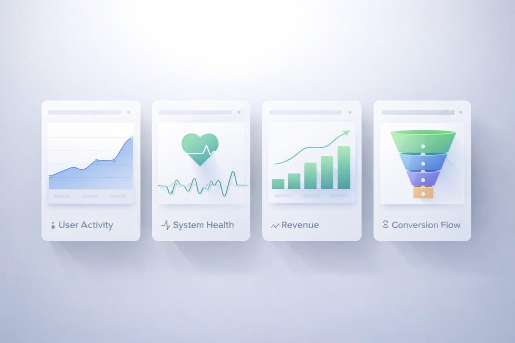
For product performance, track active users, feature adoption, retention, and session depth. These metrics show whether the product is delivering sustained value and repeat usage.
For system health, track uptime, error rate, API latency, and failed jobs. These metrics expose operational risk before it becomes visible to customers.
For commercial performance, track conversion rate, lead response time, drop-off points, and revenue by source. These are the numbers that connect product usage to commercial results.
Do not overload the first version. A dashboard with ten strong metrics is better than one with thirty weak ones.
| Metric Group | Priority Metrics | Why It Matters |
|---|---|---|
| Product | Active users, retention, feature adoption | Shows whether users are getting value |
| System | Uptime, latency, error rate | Protects reliability and user trust |
| Commercial | Conversion rate, revenue source, funnel drop-off | Connects performance to growth |
How to Design a Dashboard That Drives Decisions
A dashboard should reduce cognitive load, not increase it. Users should understand the situation within seconds, not after scanning a crowded interface.
Start with a one-screen priority model. Put the most important signals above the fold. Use trend lines, simple status markers, and direct labeling so users can interpret the screen quickly.
Organize the interface around business questions, not chart types. A block labeled Revenue Health or Service Reliability is more useful than a block labeled Bar Chart or Trend Graph.
Use progressive disclosure. The top layer should show summaries and exceptions. Detailed tables, cohort views, and segment filters should appear only when the user drills deeper.
Good dashboard design is strict. It limits color noise, avoids decorative widgets, and keeps the user focused on the next decision.
How to Build and Integrate a Core App Dashboard
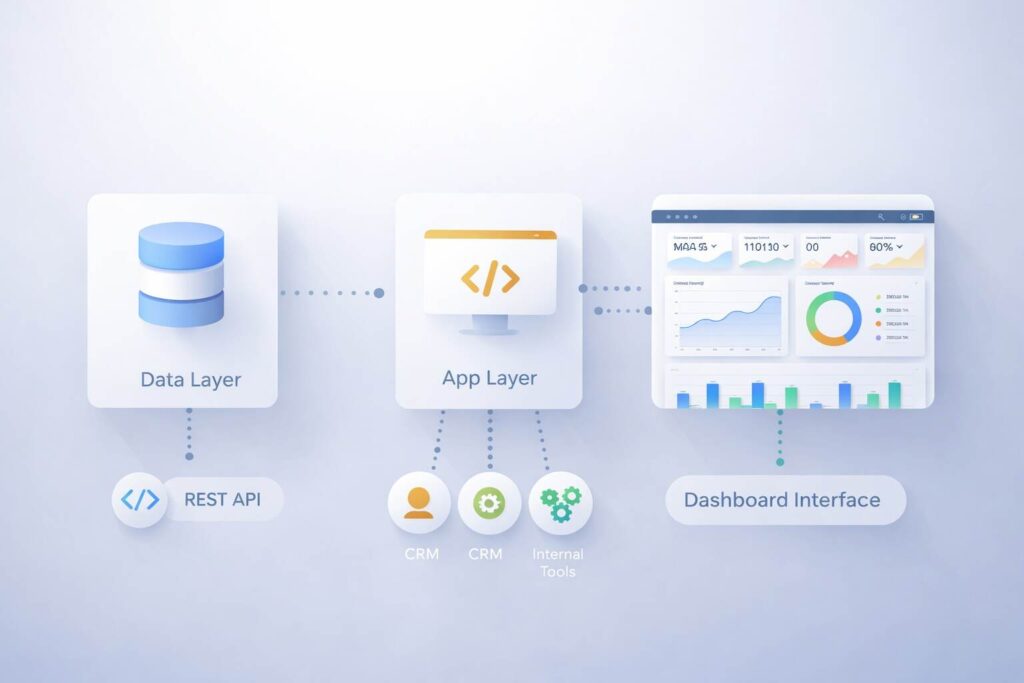
Build decisions start with the data layer. Before selecting a tool or framework, define your key entities, naming standards, timestamps, and source-of-truth rules. If the data model is inconsistent, the dashboard will never be reliable.
At the application layer, prioritize API integration, database performance, and RBAC. The dashboard must load fast, respect permissions, and pull clean data from the systems that matter.
At the interface layer, keep the structure modular. Use reusable components for KPI cards, alerts, filters, and tables. This makes the dashboard easier to scale and easier to maintain.
A practical build stack usually includes REST API or GraphQL connections, a SQL or cloud data layer, and a front-end that can support role-based rendering. The exact stack matters less than the quality of the data model and metric logic.
The Missing Piece: From Metrics to Action
This is where many dashboard pages stay shallow. They explain what metrics look like, but they do not explain how a dashboard should trigger decisions.
Every major metric needs an owner, a threshold, and a next step. Without that structure, dashboards become passive displays that teams glance at but do not use to operate.
For example, if conversion rate drops below target, the dashboard should make clear who owns the issue, what segment is affected, and what review process starts next. If API latency spikes, the interface should identify service impact and escalation path.
This is the strongest information gain angle because it changes the dashboard from a reporting layer into a decision system.
Metric -> Threshold -> Owner -> Action
Conversion Rate -> Below 2.5% -> Growth Lead -> Review funnel leak
API Latency -> Above 450ms -> Engineering Ops -> Check service bottleneck
Lead Response Time -> Above 15 min -> Sales Ops -> Reassign lead queue
Common Mistakes to Avoid
The first mistake is dashboard bloat. Teams add every available metric and create a screen that looks comprehensive but slows decision-making.
The second mistake is mixing audiences. Executives, analysts, and operators should not share the same default dashboard because their decisions are different.
The third mistake is weak metric definition. If teams disagree on what qualifies as an active user, qualified lead, or failed transaction, the dashboard loses trust.
The fourth mistake is poor action design. If users need another meeting to decide what a red metric means, the dashboard is not doing its job.
Best Tools and Frameworks to Consider
There is no universal best tool. The right choice depends on integration complexity, security requirements, performance needs, and the number of user roles.
No-code platforms are useful for validation and early prototypes. They help teams launch quickly, test the interface, and confirm which metrics matter before development expands.
Custom frameworks are better when the dashboard requires advanced permissions, event-driven updates, internal workflows, or deep backend integration. They demand more investment but provide stronger control and scalability.
The selection standard should be simple. Choose the option that gives your team reliable data, fast load times, secure access, and room to scale without rebuilding core logic.
Final Take
A strong core app dashboard is built to support decisions, not decorate data. It should surface the right KPIs, clarify thresholds, connect metrics to owners, and shorten the time between signal and action.
That is what users expect, and it is also what makes the content stronger for SEO. Pages that only describe features are common. Pages that explain how dashboards improve operational decisions are more useful, more credible, and more competitive.
FAQs
What is the primary purpose of a core app dashboard?
Its purpose is to centralize KPIs, system signals, and user activity so teams can monitor performance and act faster.
Which metrics should go on the first dashboard version?
Start with 8 to 12 critical metrics tied to product usage, system health, and revenue performance.
Should all teams use the same dashboard?
No. Use role-based views so each team sees the metrics and alerts tied to its responsibilities.
What makes a dashboard different from a report?
A dashboard supports live monitoring and action, while a report supports historical review and analysis.